
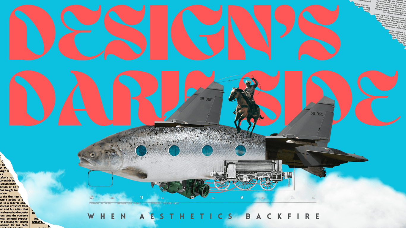

Sometimes, designs just flop. Jaguar's rebrand, Tropicana's packaging overhaul — these are stories of beautiful design that missed the mark entirely. Here's what went wrong and what every brand can learn.
Design's Dark Side: When Aesthetics Backfire
Sometimes, designs just flop. Imagine wearing a fancy outfit to a casual BBQ — you look great, but everyone's wondering where your jeans are.
01. Jaguar's Branding Backlash
Jaguar's recent redesign was a classic case of good intentions gone wrong. They rolled out a cleaner, more modern logo, hoping it would vibe with a younger crowd. Instead, longtime fans felt like Jaguar traded in its roaring personality for a quiet purr.
They loved that leaping cat. The new look didn't roar. It left people asking: 'Why fix what wasn't broken?'
02. Tropicana's Packaging Problem
Remember when Tropicana tried to refresh their OJ cartons in 2009? They ditched their classic orange-with-a-straw image for something sleeker. Sales dropped 20% in just one month.
That old design wasn't just 'familiar' — it was how shoppers instantly spotted their juice. Once it was gone, they moved on to other brands. Tropicana had to backtrack fast.
The Lesson
What looks cool in a design studio doesn't always fly in the supermarket aisle. The best rebrands evolve a brand's visual language — they don't erase it. Your design should feel like a natural step forward for your audience, not a surprise they didn't ask for.
Before you redesign, ask: What does your current design mean to your customers? Are you willing to risk losing that meaning in pursuit of something new?
Suggested
Continue Reading
More articles you may find useful, carefully selected from our journal


