
What Graphic Designers Can Learn from Movie Posters
By Manasvi Pote {13.02.2025 - Bengaluru}
By Manasvi Pote {13.02.2025 - Bengaluru}
You’re walking down a busy street on a lazy afternoon when suddenly, a billboard grabs your attention—a movie poster so vivid it almost seems to breathe. In that moment, the everyday buzz fades away, and you find yourself lost in its simple, yet intriguing design. That’s the magic of graphic design. A well-crafted movie poster does more than advertise a film; it tells a story, sparks emotion, and connects with you in a way that feels personal. Kabir Kashyap, as someone who lives and breathes graphic design at Kabir Kashyap Design Co., learnt that the secrets hidden in these posters can completely change your approach to design. Today, let’s take a fun and insightful journey into some of the best movie posters ever made and see how their clever use of graphic design can help you create work that’s not only clear and engaging but also life-changing for your creative journey
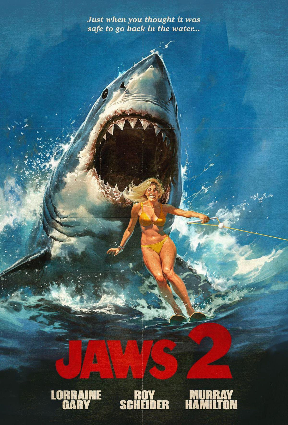
Think about the Jaws poster for a moment. You see that big, looming shark emerging from dark waters? It’s not cluttered or overloaded—just one powerful image that makes you feel both fear and fascination.
In graphic design, simplicity often wins the day. The Jaws poster teaches us that a well-placed, bold element can grab attention and spark curiosity without overwhelming your audience. It’s a neat reminder that in graphic design, sometimes less is more.
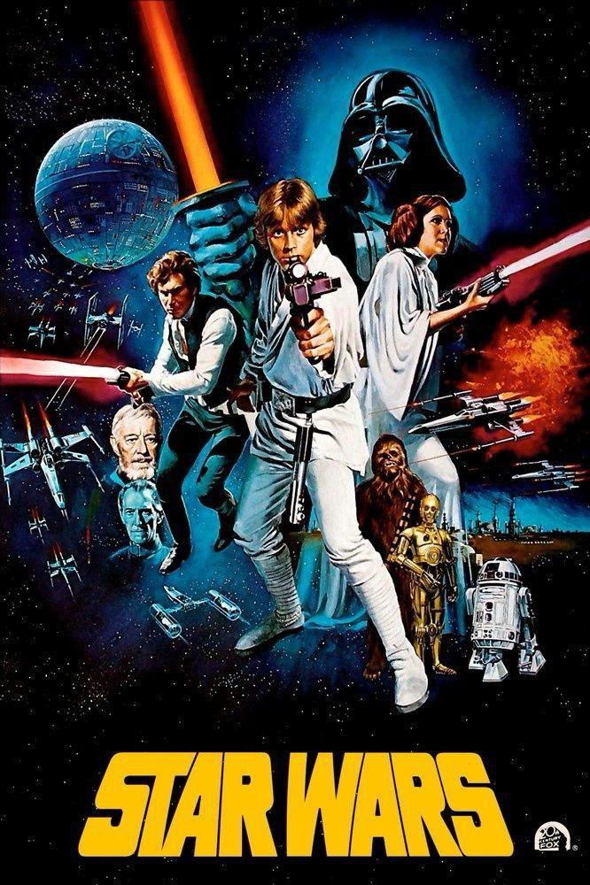
Now, let’s talk about the Star Wars poster. This poster isn’t just a picture; it’s an invitation to adventure. With its bold visuals and thoughtful placement of text, it shows us how graphic design can create a universe on a piece of paper.
Every line, every splash of color, every carefully placed image speaks a language that transcends words. For anyone working in graphic design, Star Wars is a lesson in balancing creative imagery with clear communication. It reminds you that every element in your design should contribute to a bigger story.

Then there’s The Godfather poster. It’s not busy or flashy—instead, it whispers secrets. Its subtle, almost mysterious design proves that graphic design doesn’t always need to shout to be heard.
This poster teaches you that sometimes a quiet, restrained approach can be far more compelling. The sparse use of imagery and text draws viewers in, inviting them to look deeper. In your graphic design journey, think of The Godfather poster as a nudge to experiment with what you leave out, not just what you put in.
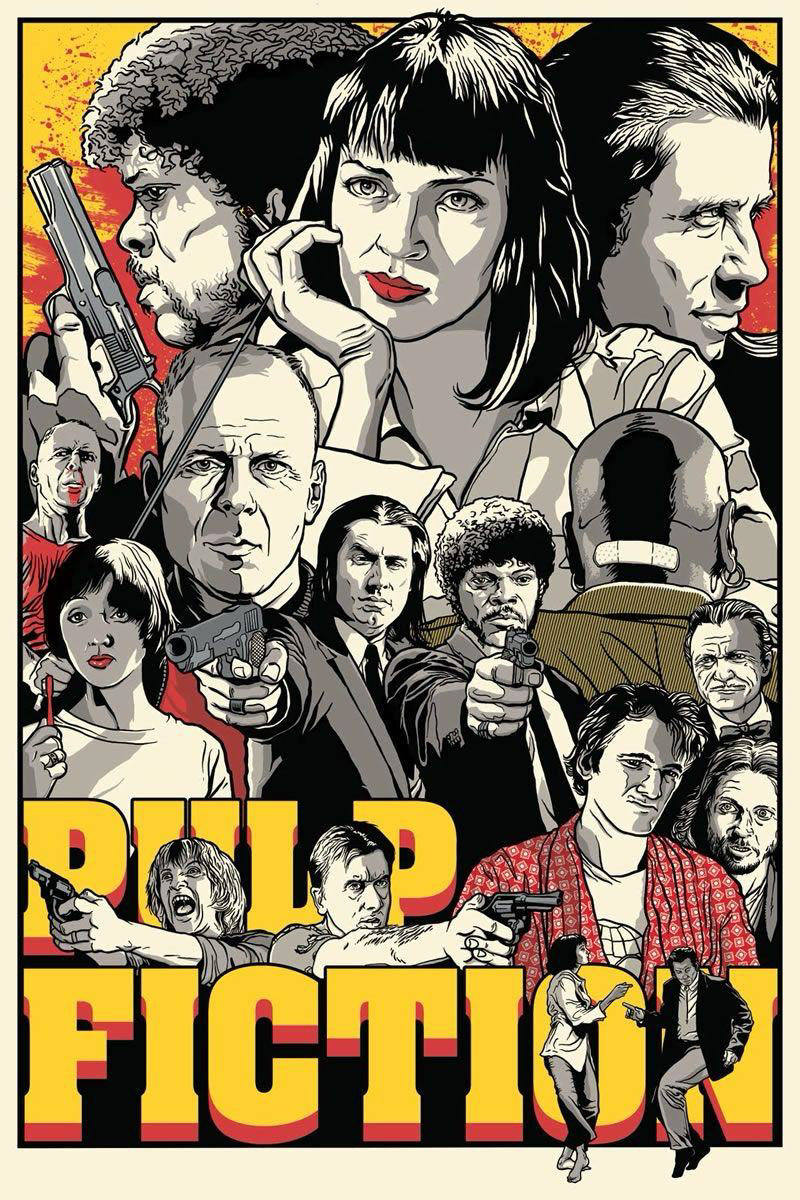
Pulp Fiction’s poster brings something entirely different to the table. It’s playful and a little offbeat, reminding us that graphic design can break a few rules without losing its charm.
With its quirky elements and unconventional layout, this poster shows that taking a creative risk can lead to something memorable. When you work on your graphic design projects, don’t be afraid to mix things up and add a bit of your own personality—even if it means stepping outside the lines of traditional design. It’s all about finding that sweet spot between structure and spontaneity.
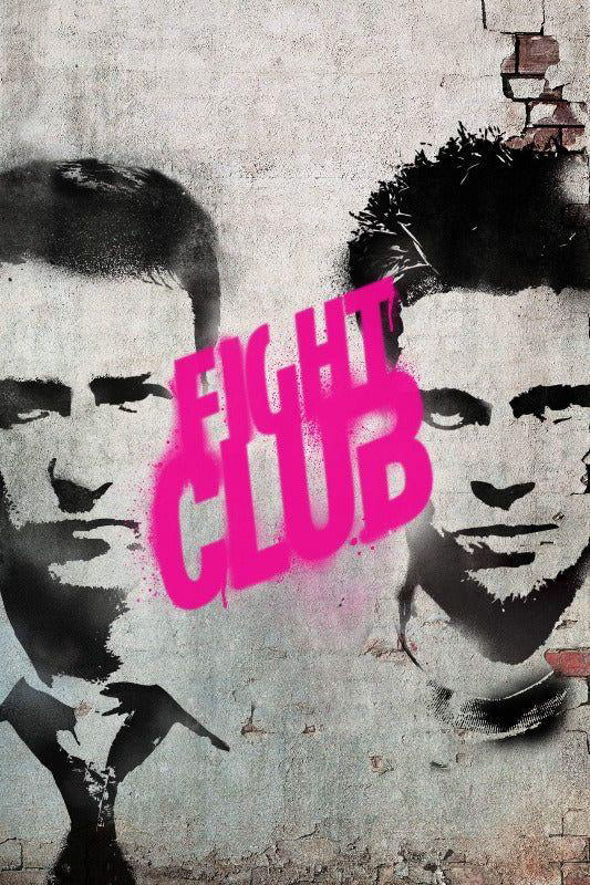
Next up is Fight Club’s poster. With its clean, straightforward look, it tells you that graphic design can be direct and powerful at the same time. No extra frills, just a clear message that catches your eye. This design is a lesson in how clarity and focus are key in graphic design.
Every line, every shape is there for a reason, helping to guide the viewer through the message without distraction. At Kabir Kashyap Design Co., they often reflect on this approach, ensuring that every piece of our graphic design communicates its intended message in the simplest, most effective way possible.
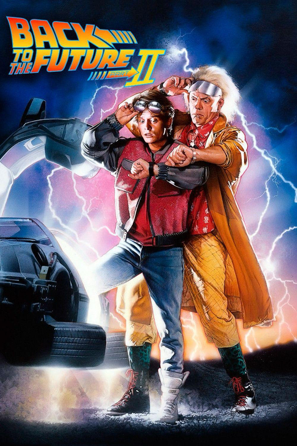
Finally, we have the Back to the Future poster—a burst of fun and energy. Its bright colors and dynamic shapes create an atmosphere that feels both exciting and inviting. This poster is proof that graphic design can be lighthearted yet powerful.
It shows that a vibrant, upbeat design can capture the imagination and leave a lasting impression. For any graphic designer, this is a reminder that you can let your creative spirit shine, and that your work doesn’t always have to be serious to make an impact.
Throughout these examples, one thing is clear: graphic design is a powerful tool that tells stories, sparks emotions, and creates connections. Whether it’s the bold simplicity of Jaws, the adventurous spirit of Star Wars, or the playful defiance of Pulp Fiction, each movie poster has a lesson to offer that can transform your approach to graphic design.
At Kabir Kashyap Design Co., they put these lessons into practice every day. We believe that good graphic design isn’t just about making something look nice—it’s about creating work that speaks to people, inspires them, and even changes the way they see the world.
So next time you’re working on a design, think back to these movie poster classics. Let their lessons guide you to make your graphic design as engaging, clear, and bold as the stories they tell. Happy designing, and may your creative journey be as timeless as these unforgettable posters!