PROJECT BRIEF
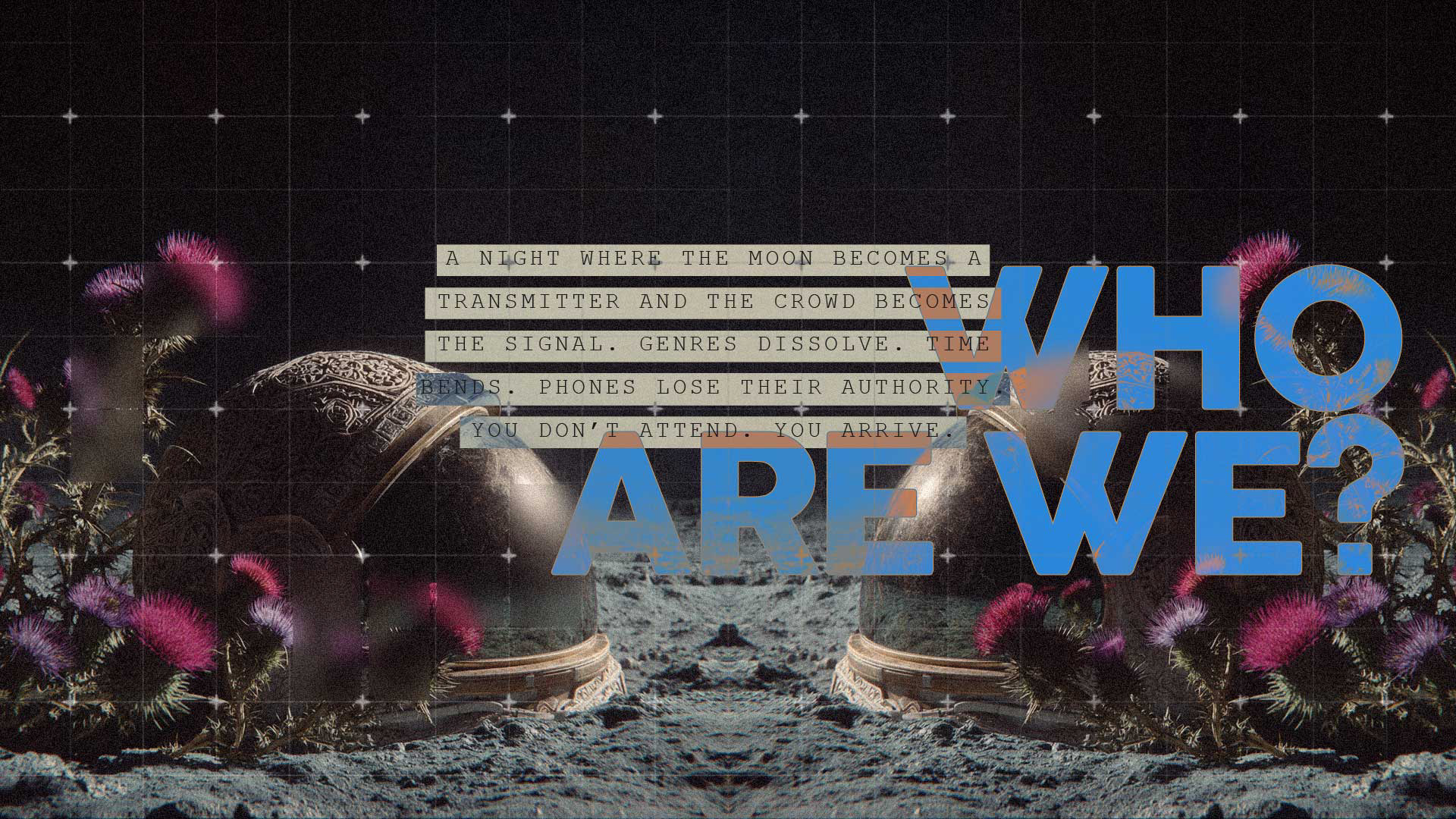
Moon Music Festival is not a concert.
It is a transmission.
It is a transmission.
Set in a speculative future where music has been flattened into data and emotion has been optimised out of experience, Moon exists as a rupture in the system. A temporary portal where sound regains weight, bodies reclaim rhythm, and collective presence becomes an act of resistance.
The brief was to create a visual identity for a festival that doesn’t just host music but questions how we consume it. A world that feels slightly off-grid, slightly ancient, slightly futuristic. Something that lives between science fiction and spiritual memory.
Moon needed to feel like a signal intercepted. A place you don’t stumble upon but tune into.
The visual language had to hold contradiction:
organic and engineered, cosmic and grounded, sacred and disruptive.
organic and engineered, cosmic and grounded, sacred and disruptive.
This is not nostalgia. This is not escapism. This is a return.
OUR APPROACH
We approached Moon as a myth-in-the-making rather than an event brand.
The system starts with a fictional premise:
What if music was never meant to be consumed endlessly?
What if it was meant to be gathered around, like fire?
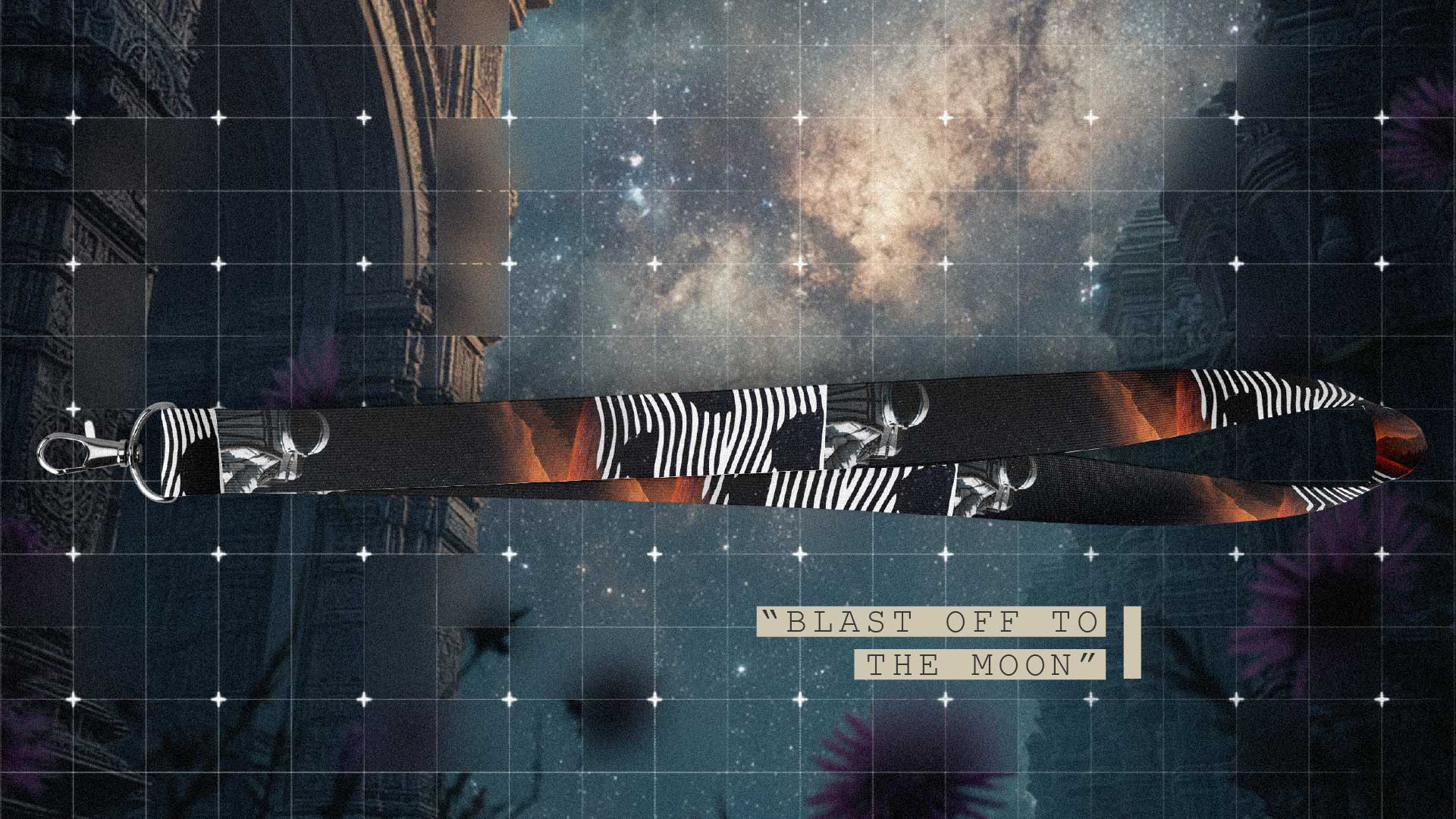
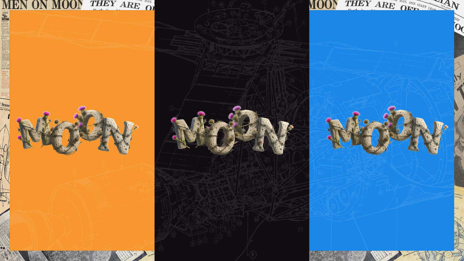
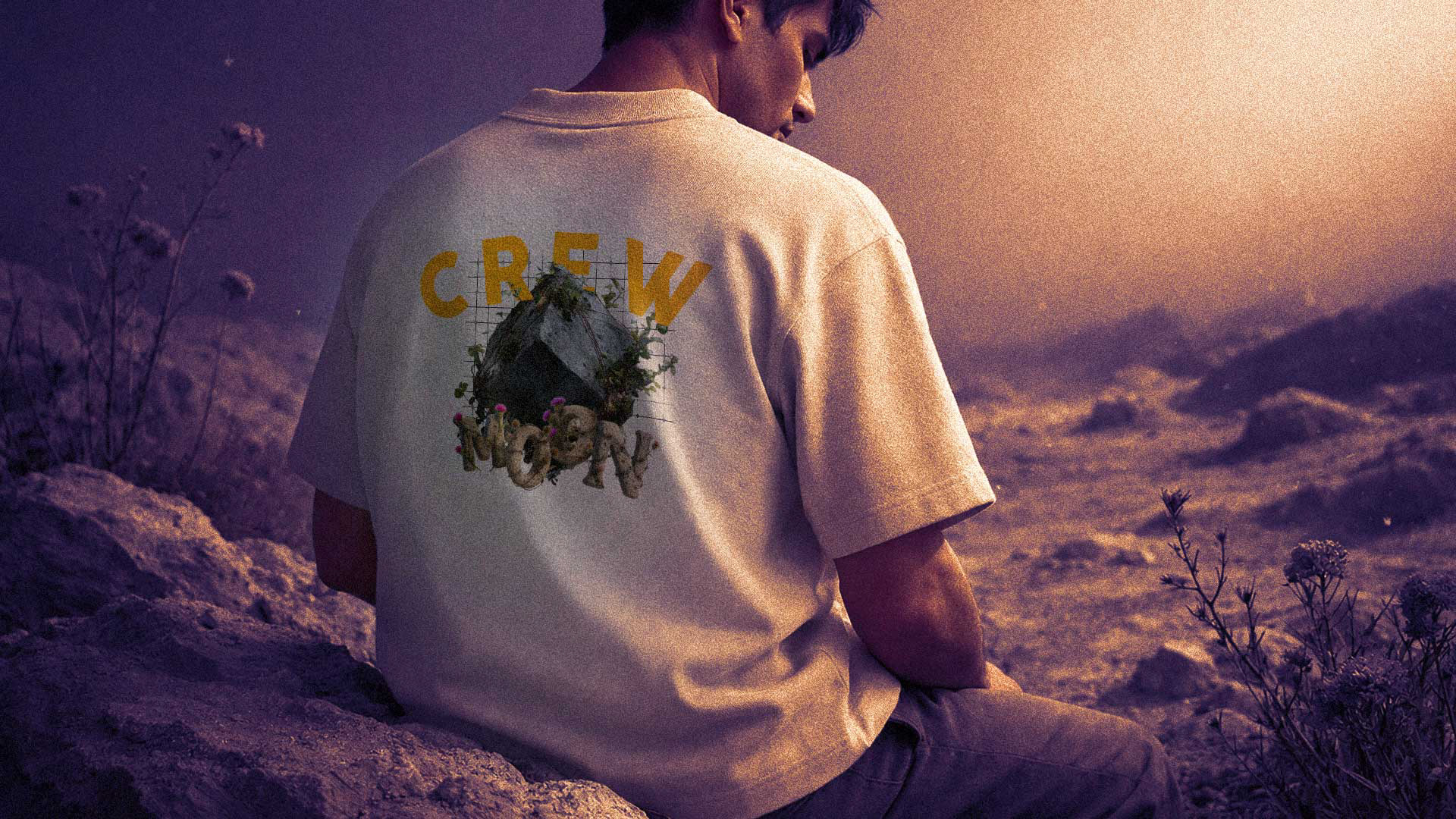
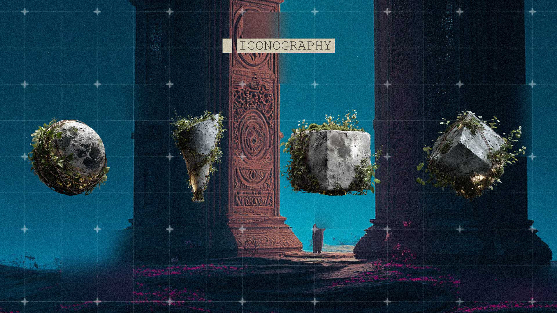
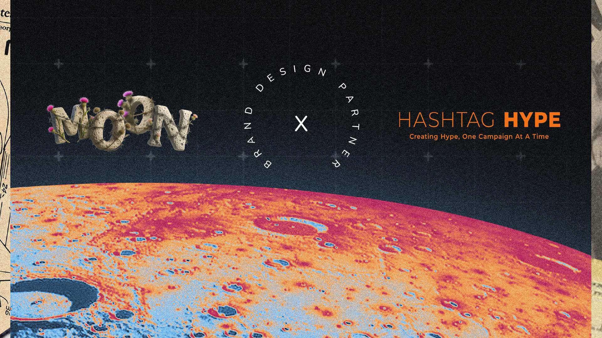
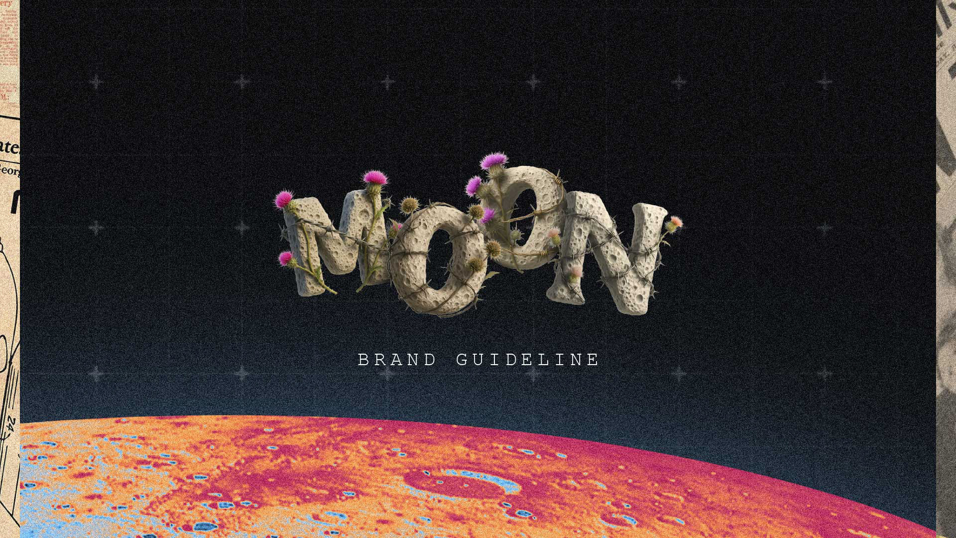
From there, we built a universe where technology doesn’t dominate nature but coexists with it. Brutalist structures meet celestial grids. Ancient ruins float in zero gravity. Moss grows over machinery. Typography feels carved, eroded, almost grown rather than designed.
Every visual element acts like a relic from an alternate timeline.
The moon becomes both symbol and signal.
A transmitter. A witness. A quiet authority.
A transmitter. A witness. A quiet authority.
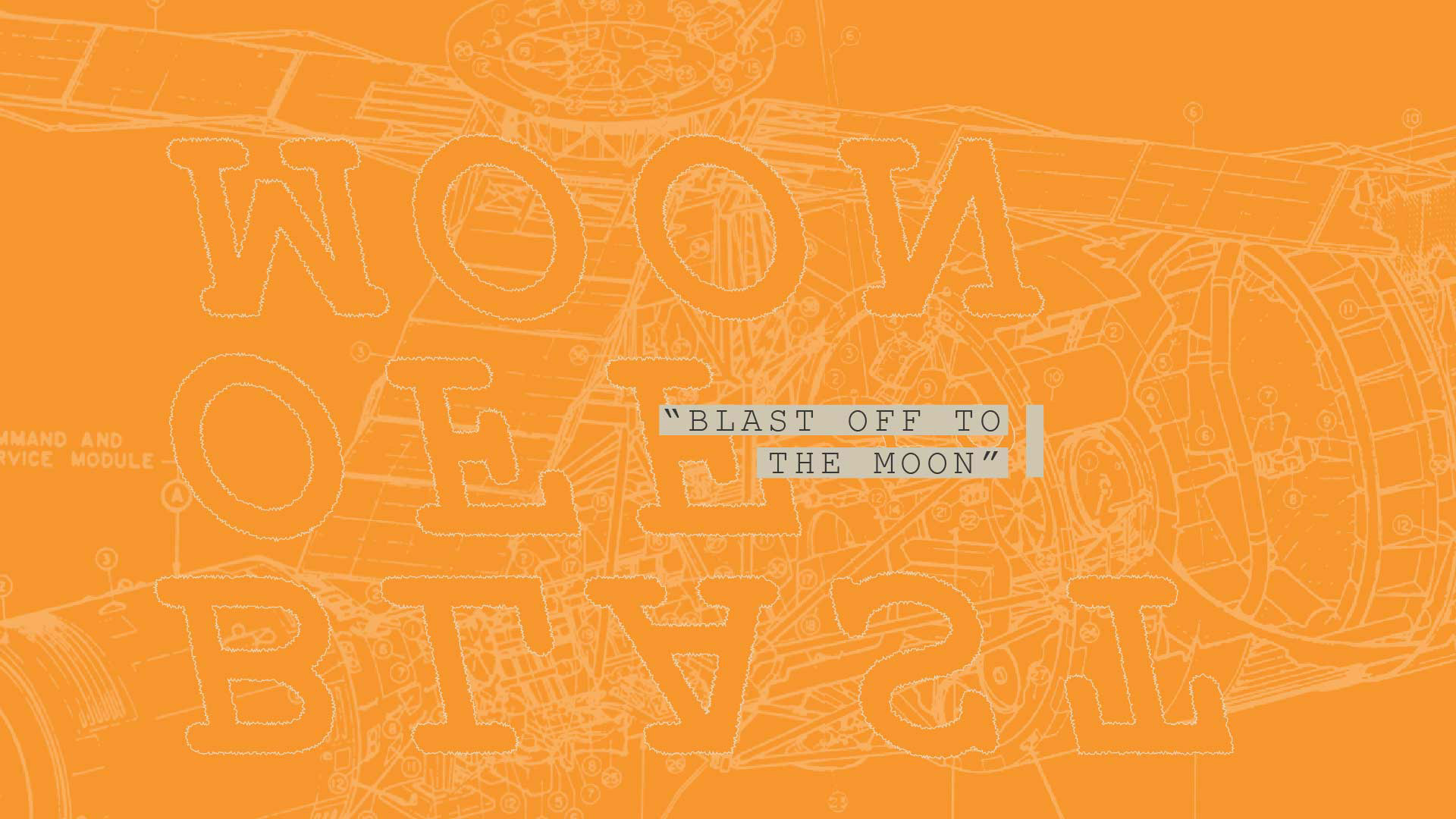
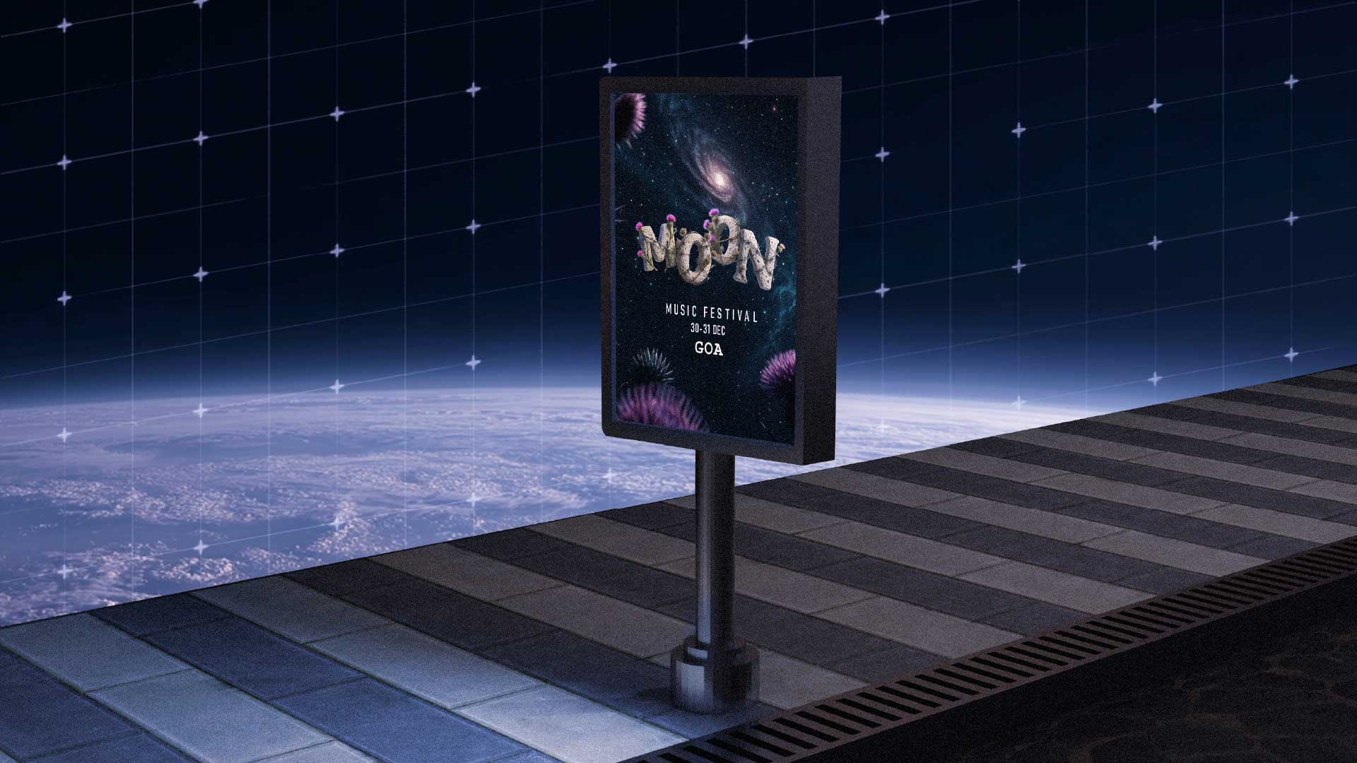
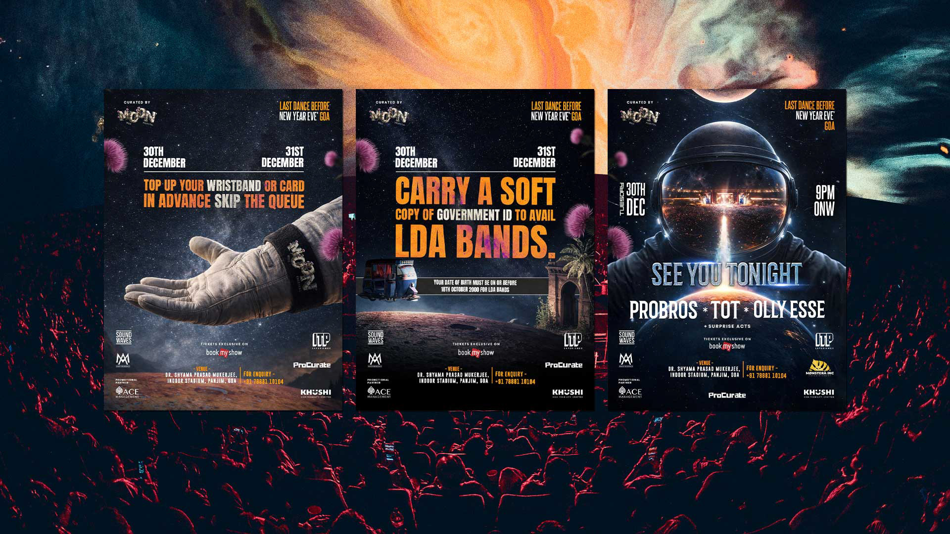
We treated the brand like a broadcast from another frequency. Posters feel like transmissions. Tickets feel like artefacts. Signage feels like fragments of a larger system you’re stepping into.
Nothing is overly explained. Everything is slightly encoded.
Because Moon is not meant to be understood instantly.
It’s meant to be felt.
It’s meant to be felt.
DESIGN PHILOSOPH
1. Nature vs Machine
Organic forms clash gently with engineered geometry. Moss-covered textures sit against grid systems and architectural precision. The tension between chaos and control mirrors the tension between humans and algorithms.
2. The Sacred Future
Visuals borrow from ancient architecture, astronomy, and ritual spaces, reimagined through a sci-fi lens. The moon becomes both deity and data point. Time collapses. Past and future coexist.
3. Imperfect by Design
Grain, noise, erosion, and asymmetry are intentional. Nothing feels factory-perfect. The world feels lived in, weathered, and touched by time.
4. Signal Over Noise
Typography is bold, declarative, and spatial. Text behaves like transmission rather than decoration. Words appear as coordinates, warnings, or invitations.
5. Community as Constellation
People are not spectators but components of the system. The crowd becomes the circuitry. Movement, sound, and presence complete the experience.